Start a portfolio dashboard in a builder that sits on shadcn/ui’s default theme and you begin with a white card, a near-black button and no colour for a gain, so the green comes from wherever the model finds one. Nobody chose those values. The model filled every decision the prompt left open with the value it has seen most often.
That sameness is a style problem on most screens. On a screen that shows money, some of the defaults are wrong: a green that fails contrast, digits that don’t line up, a hyphen where a minus should be. A design system fixes both, because it turns the open decisions into named ones an agent can read.
In short
- A model fills every open property with its most likely value, so unguided apps converge on the same starter theme.
- The builders document their starting point. v0 starts from shadcn/ui, whose default theme has a near-black primary and no colour for a gain.
- On money screens some defaults are wrong, not just plain: contrast, digit widths, signs and currency labels.
- The fix is decisions written down where an agent reads them: variables, text styles, real data and a rules file.
Why defaults win
A prompt names a few things: the screen, the product, maybe a colour. A dashboard has hundreds of properties beyond that, from the radius of a card to the colour of a loss. For each one the model has to pick something, and with nothing to read it picks what is most common in the code it learned from, which is full of starter templates and default themes.
So the sameness isn’t a flaw in the model. It’s missing input. Give it a decision to read and it uses that instead.
The builders document the defaults they start from
- v0: its docs say it uses shadcn/ui as its default component system. You can replace the defaults with your own tokens through a registry, overwriting the variables in
tokens.css. - shadcn/ui: the default theme sets
--primarytooklch(0.205 0 0), a near-black, and--radiusto0.625rem. It has a colour for destructive actions but none for success or a gain. - Figma Make: it reads a guidelines folder, and Guidelines.md is the first file it looks at. Rules written there are decisions; vague taste guidance hands the choice back to the model.
A finance app built on that starting point inherits a black-and-white theme and has to borrow a green from somewhere, because the theme doesn’t have one.
On a money screen, a default can be wrong
- Gains: with no token for a gain, the green comes from a palette. A bright green such as
#22C55Eon white measures 2.28:1, well under the 4.5:1 that WCAG asks for normal text. - Digits: many UI fonts use proportional figures by default, Geist among them. In our test card the four changes measured 45.5, 44.6, 44.8 and 40.3 px wide, so the column didn’t line up. With
tabular-numseach was 45.4 px. - Signs: a keyboard types a hyphen. A loss should use the minus sign, −0.52%, which is the width of a plus and reads as a number.
- Currency: “Portfolio value” doesn’t say in what. A label like “Portfolio value (EUR)” does.
- Figures: without real data, a model makes up sample numbers for each screen, and nothing checks that the total on the dashboard matches the holdings on the next one.
The fix: decisions written where an agent reads them
A design system is a set of decisions made once and given names. For an agent, the names matter as much as the values, because a name is what it can read and reuse. Viola UI stores them in three places:
- Variables: 45 colour tokens, each with a Light and a Dark value, such as
semantic/positiveat#047857in Light and#10B981in Dark. - Text styles: 25 styles in Geist, with tabular figures on the styles used for money.
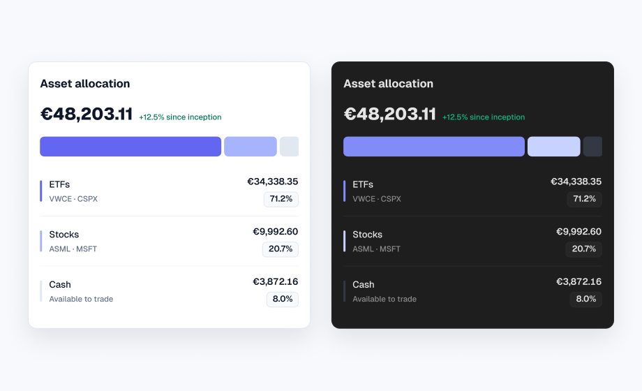
- Data: one sample portfolio that every screen draws from, so €44,330.95 in holdings plus €3,872.16 in cash is €48,203.11 wherever the total appears.
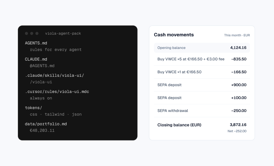
The fourth piece is a rules file the agent loads every session. Viola UI’s comes in the free agent pack, and there’s a shorter CLAUDE.md you can copy in the guide to building a screen with Claude Code.
One card, property by property
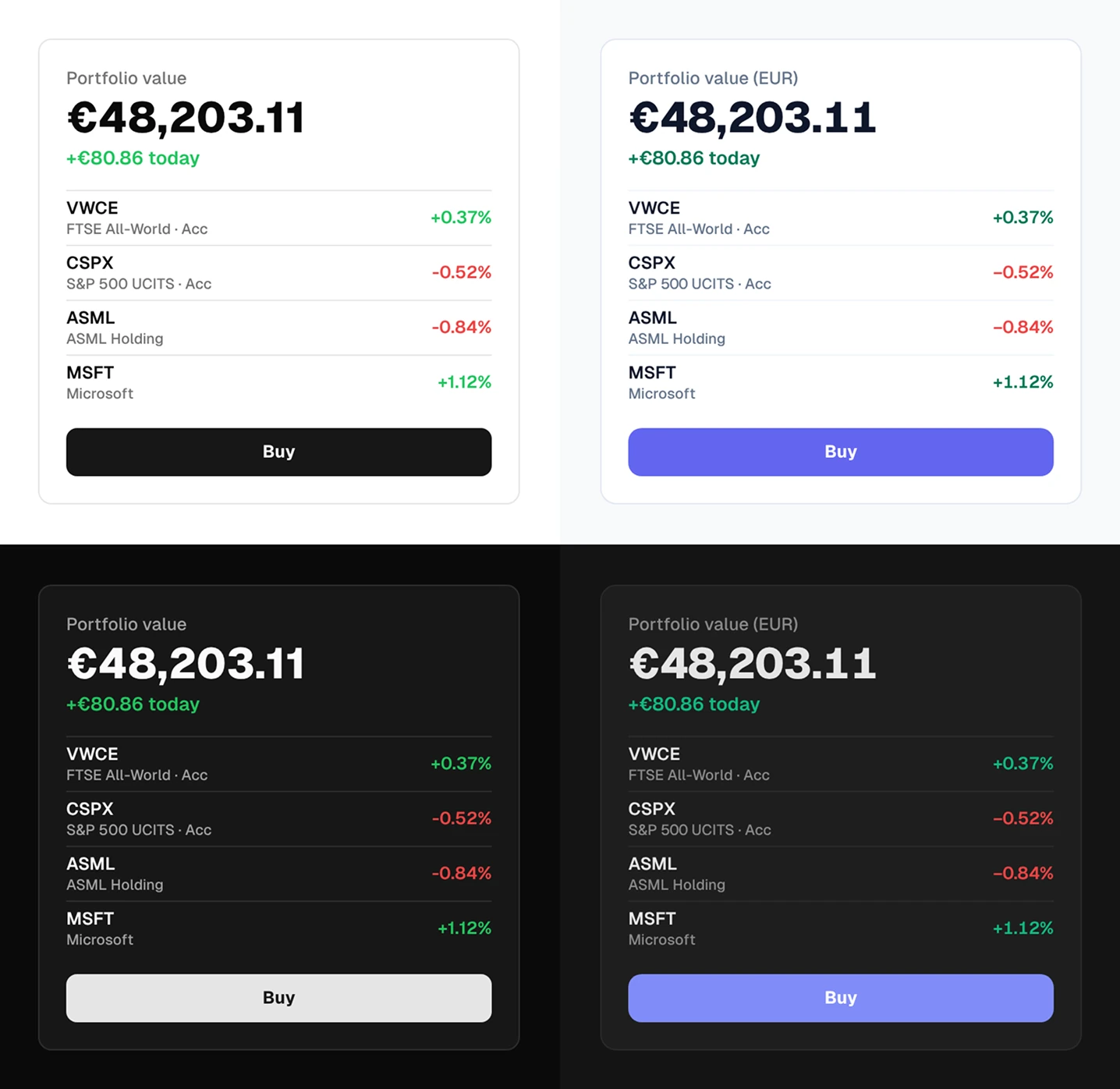
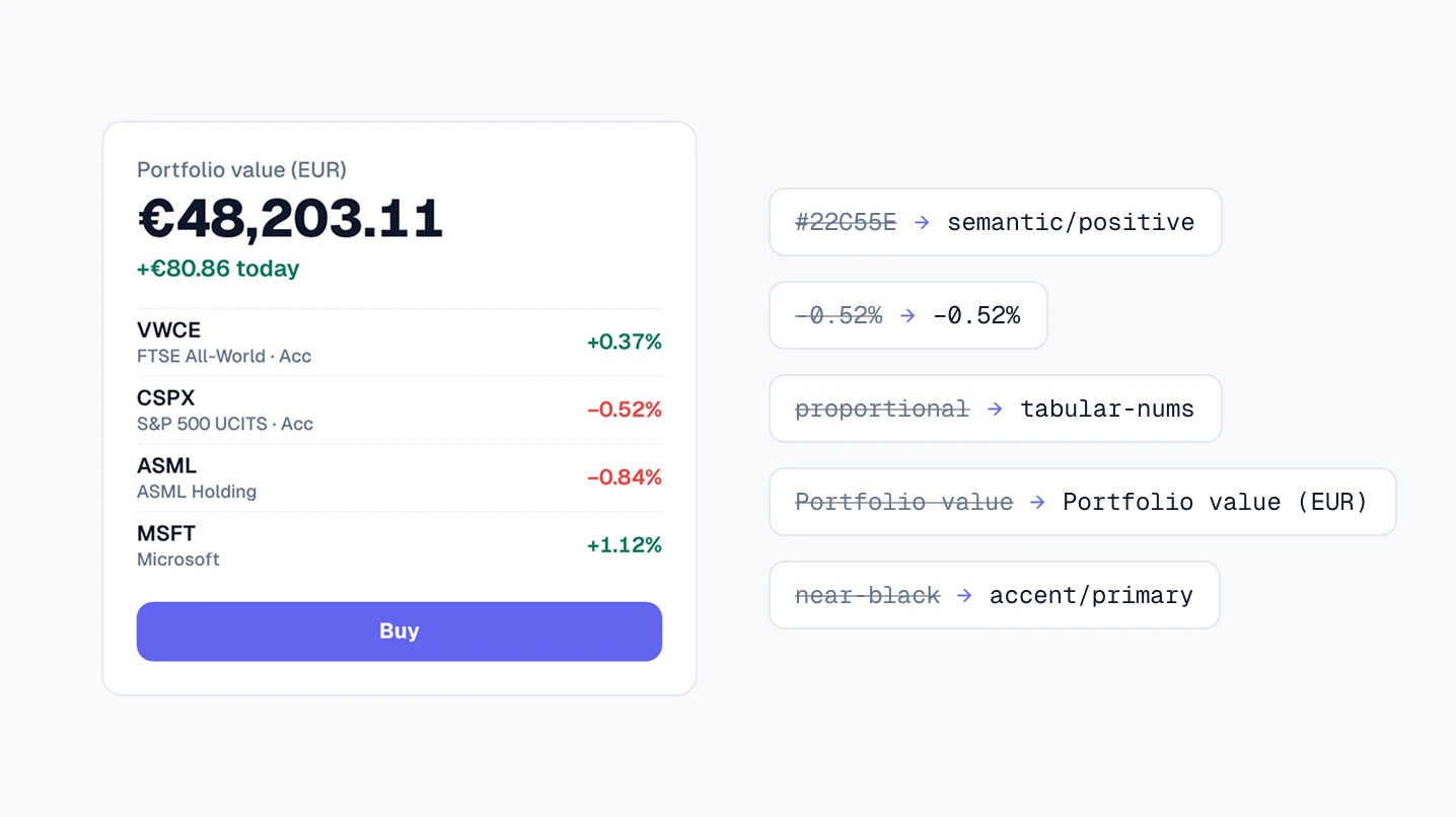
Both cards look tidy, which is the point: the problems with defaults are in details that are easy to miss and that matter for money.
| Property | Left by default | Viola UI |
|---|---|---|
| Card corners | --radius 0.625rem | radius/xl, 12 px |
| Label | Portfolio value | Portfolio value (EUR) |
| Gain colour | #22C55E in both modes | semantic/positive |
| Gain on white | 2.28:1 | 5.48:1 |
| Loss sign | -0.52% (hyphen) | −0.52% (minus) |
| Digits | Proportional | Tabular |
| Buy button | --primary, near-black | accent/primary |
Each Viola value has a Dark counterpart, so the right card switches modes with one class and no second stylesheet. Contrast ratios calculated with the WCAG 2 formula on 29 October 2026.
Review what still drifts
Even with a design system, an agent sometimes types a value instead of reading one. Three checks catch most of it:
- Colours: no hex,
rgb()or palette class such asgreen-500in a component. - Dark mode: no
dark:variants. If one appears, a colour is missing from the variables. - Numbers: tabular figures, a sign on every change, the minus sign for losses and figures that match the data.
The guide to Claude Code has a one-line search for the first two. The finance UI checklist covers the rest.
Shared values are fine once they’re named
Viola UI uses Geist and a violet accent. Neither is rare, and a design system doesn’t need to be unusual to work. What matters is that each value was chosen once, named, and used everywhere through a variable. Change accent/primary and every button, link and active tab follows. A generated app that typed its colour on every screen has to be fixed screen by screen.
A test: did the agent decide or guess?
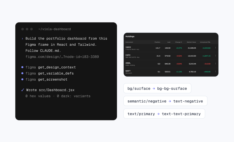
Ask an agent to rebuild a screen you already have, then read the output. If it’s full of literal hex values and pixel sizes, it guessed. If it uses your variable names, it read them. Then switch to Dark and compare the totals with the data. A design system passes all three without a second prompt.
Free Figma file with the decisions made
Viola UI’s free file on Figma Community has the portfolio dashboard in light and dark, with the colour variables and text styles already set up.
- The portfolio dashboard in light and dark
- 190+ component variants
- 39 icons
Free for personal and commercial projects.
FAQ
Why do AI-generated apps look generic?
Because the model picks the most likely value for every decision the prompt leaves open, and those values come from starter templates and default themes.
Does a longer prompt fix it?
Partly. A prompt covers what it names. Variables and a rules file the agent reads every session cover the properties nobody thinks to mention.
Can I give v0 or Figma Make my own design system?
Yes. v0 takes your tokens through a registry, and Figma Make reads the files in its guidelines folder, starting with Guidelines.md.
Is there a free rules file for Viola UI?
Yes. Get the agent pack, free: rules for any agent, a Claude Code skill and a Cursor rule. The CLAUDE.md in our Claude Code guide is free to download too. Both work with the free file and the full kit.
Need the whole product?
The full Viola UI kit has 100+ screens, every one in light and dark, on the same variables, including trading, transfers, fund research, settings and onboarding. $49 for one designer, $179 for your whole company.
Sources
- Design systems, v0 Docs, read 29 October 2026
- Theming, shadcn/ui, read 29 October 2026
- Write design system guidelines for Make kits, Figma Learn, read 29 October 2026
- Understanding Success Criterion 1.4.3: Contrast (Minimum), W3C, read 29 October 2026
- font-variant-numeric, MDN, read 29 October 2026

WRITTEN BY
Kseniya Savitsyna
Product designer working on fintech & AI products, and the designer behind Viola UI.