Claude Code can turn a Viola UI screen into React and Tailwind if it has two things: the frame, which it reads through Figma’s MCP server, and the rules, which it reads from a CLAUDE.md file in your project. This guide builds one screen, the portfolio dashboard from Viola UI’s free file, and checks it in light and dark.
Everything below comes from one real run with Claude and Figma’s MCP server. The rules file, the token table and the code are the ones we used, and the screenshots show what the browser rendered.
In short
- Figma’s MCP server gives Claude Code the layout and the variables of a frame.
- A CLAUDE.md file gives it Viola’s rules: variables only, Geist text styles, signed tabular numbers.
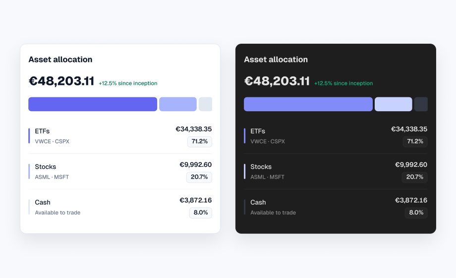
- Every colour points at a CSS variable, so dark mode is one class on the page.
- You still review the result: a rules file is context, not a lock.
Two sources: the frame and the rules
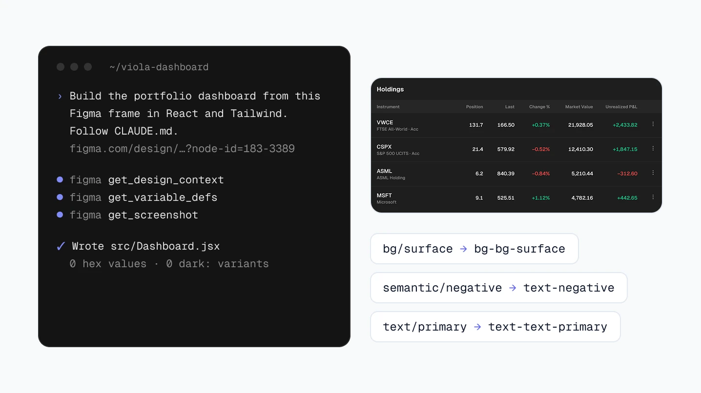
Figma’s MCP server answers what is on the screen. Its get_design_context tool returns code for a frame, React and Tailwind by default, and get_variable_defs lists the variables the frame uses, such as bg/surface or semantic/positive.
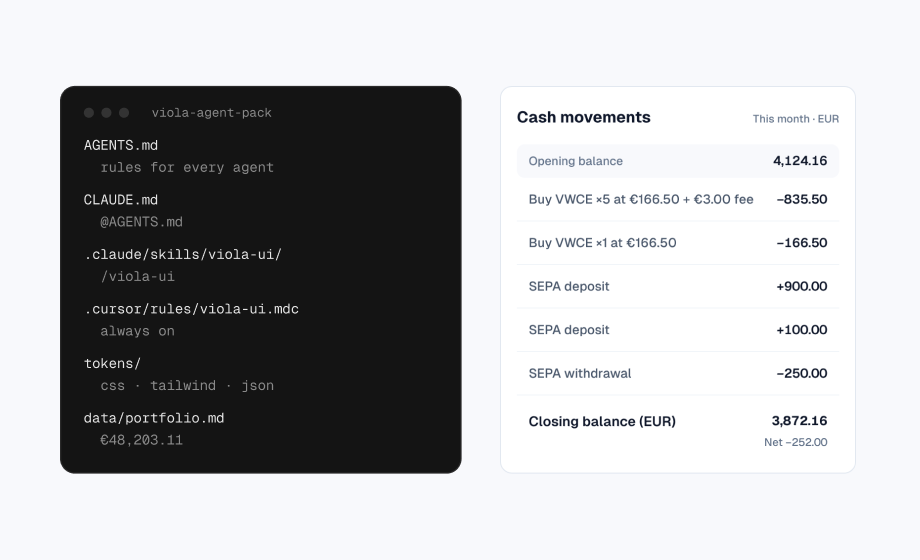
The server doesn’t know your product. It doesn’t know that green means a gain and nothing else, or that numbers line up in columns. That goes in CLAUDE.md, a Markdown file Claude Code loads at the start of every session. Claude treats it as context, not as enforced configuration, which is why the last step is a review. Without it, the model fills the gaps with defaults, which is why unguided apps look the same.
Six steps from frame to code
- 1. Connect Figma. In a terminal, run
claude plugin install figma@claude-plugins-official, restart Claude Code, open/pluginand sign in to Figma. - 2. Duplicate the free file. Open Viola UI’s free file on Figma Community and duplicate it to your drafts, so its frames have links you can copy.
- 3. Add the rules. Put
CLAUDE.mdin the project root, withtokens.cssand the Tailwind config described below. - 4. Copy the frame link. Select the Portfolio | Dashboard frame and choose Copy link to selection.
- 5. Prompt. Write “Build the portfolio dashboard from this Figma frame in React and Tailwind. Follow CLAUDE.md.” and paste the link.
- 6. Review and compare. Run the checks below and put the browser next to the frame in both modes.
Without the plugin, claude mcp add --transport http figma https://mcp.figma.com/mcp adds the server on its own. Then open /mcp, select figma and choose Authenticate.
What the MCP server sends back
For the dashboard frame, get_design_context returned a React component of about 1,000 lines. Every colour already pointed at a variable, written as text-[color:var(--text\/primary,#0f172a)] with the hex as a fallback. That’s a good start, but it isn’t the code you keep: positions are absolute, every layer carries a data-node-id, and for a frame this size the response was cut off at 100,000 characters. Ask for large frames section by section.
In our run, get_variable_defs returned the Light values only, the mode the dashboard frame is in. We read both modes with Figma’s use_figma tool. You can also copy the Dark column from the Variables panel.
The rules file
This is the CLAUDE.md we used. Copy it into your project and change the paths if yours differ.
# Viola UI screens in code

This project builds screens from the Viola UI Figma kit in React and Tailwind.

## Colours
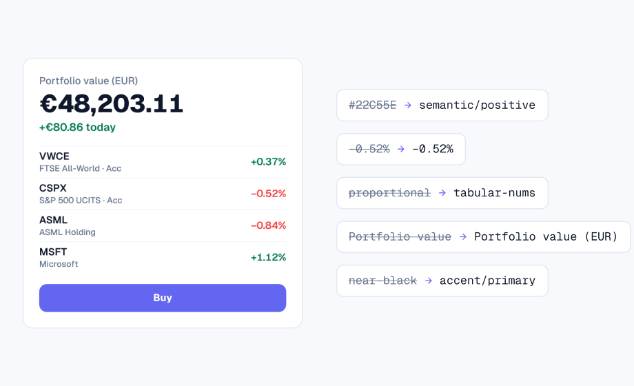
- Every colour is a Viola variable. Figma `bg/surface` is the CSS variable `--bg-surface` and the Tailwind class `bg-bg-surface`. The full list is in `src/tokens.css`.
- Never write a hex value, `rgb()` or a Tailwind palette colour such as `slate-500` in a component.
- Dark mode comes from the `.dark` class on `<html>`, which swaps the variables. Never add `dark:` variants or a second palette.
- Green (`positive`) and red (`negative`) are only for gains and losses. Buttons and links use `accent`.

## Type and spacing
- Font is Geist. Use the text styles in `tailwind.config.js` (`text-caption`, `text-label`, `text-number`, `text-body`, `text-title`, `text-heading`, `text-display`), not pixel sizes.
- Spacing uses Tailwind's 4px scale, which matches Viola's `space/*` tokens. Radius uses `rounded-xs` to `rounded-xl`.

## Numbers
- Every number uses `tabular-nums`. Amounts and changes are right-aligned in tables.
- Negative values use the minus sign (−), not a hyphen.
- Every change has a sign: +0.37%, −0.52%.
- Copy figures exactly from the frame. Never round, recalculate or invent a number. If a figure looks wrong, list it in your summary instead of changing it.

## Assets
- Icons are SVGs in `src/icons.js` and use `currentColor`, so their colour comes from a text class.
- Chart lines and sparklines are SVGs from the frame, with their colours replaced by variables.

## When something doesn't fit
- If a value in the frame has no matching variable, don't invent one. Say which layer it is and what value it has, and leave it out.Using Cursor or Codex too? Get the full agent pack, with a skill and Cursor rule.
Next to it, tokens.css holds every Viola colour twice, once under :root for Light and once under .dark, and the Tailwind config points each class at a variable. The names follow Figma’s, so bg/surface becomes --bg-surface and the class bg-bg-surface.
| Figma variable | Tailwind class | Light / Dark |
|---|---|---|
| bg/page | bg-bg-page | #F8F9FC / #141414 |
| bg/surface | bg-bg-surface | #FFFFFF / #1E1E1E |
| border/default | border-border-default | #E2E8F0 / #2A2A2A |
| text/primary | text-text-primary | #0F172A / #E5E5E5 |
| text/muted | text-text-muted | #64748B / #8A8A8A |
| accent/primary | bg-accent-primary | #6366F1 / #818CF8 |
| semantic/positive | text-positive | #047857 / #10B981 |
| semantic/negative | text-negative | #EF4444 / #EF4444 |
The code reads like the token table
Here is one row of the holdings table from the component, shortened. There is no hex, no pixel font size and no dark: variant. The colour of a change comes from its sign, so a loss can’t be painted green by mistake.
const signClass = (value) =>
  value.startsWith('−') ? 'text-negative' : 'text-positive';

<tr className="h-[62px] border-b border-border-subtle">
  <td className="px-4">
    <p className="text-body font-semibold text-text-primary">CSPX</p>
    <p className="text-caption text-text-muted">S&P 500 UCITS · Acc</p>
  </td>
  <td className="px-4 text-right text-number tabular-nums">21.4</td>
  <td className={`px-4 text-right text-number tabular-nums
    ${signClass('−0.52%')}`}>−0.52%</td>
  <td className="px-4 text-right text-number tabular-nums">12,410.30</td>
</tr>
Review three things before you ship
- Colours: no hex, no
rgb()and no palette class such asslate-500in a component. - Dark mode: no
dark:variants. If one appears, a colour is missing fromtokens.css. - Numbers:
tabular-numson every figure, a sign on every change, the minus sign for losses, and figures copied from the frame, not recalculated.
A search over the diff catches most colour mistakes:
git diff -U0 -- '*.jsx' | grep -nE \
  '#[0-9A-Fa-f]{6}|rgb\(|(slate|gray|red|green|blue)-[0-9]{2,3}|dark:'
In our run it found nothing. Numbers are quicker to check by eye, with the browser next to the frame.
Compare with the frame in both modes
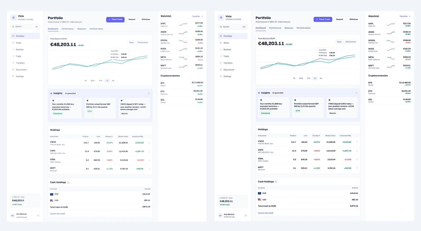
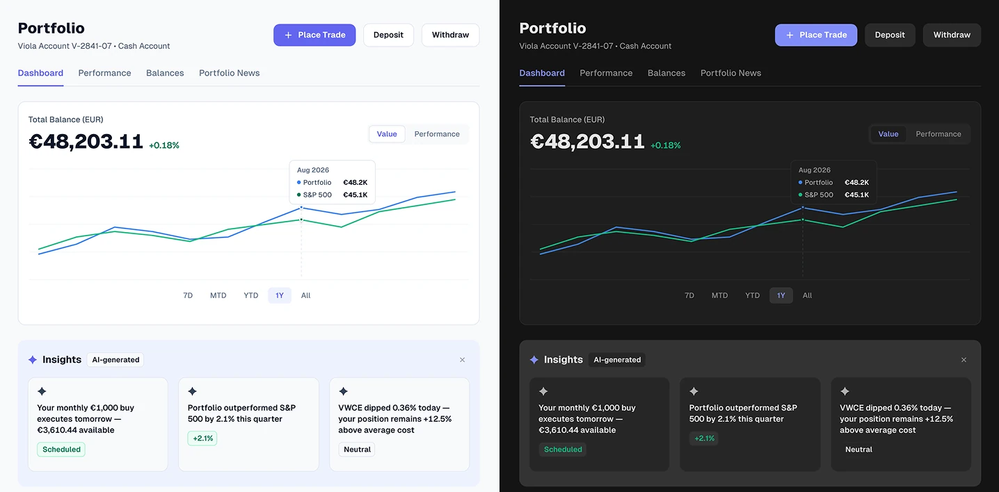
<html> changes.The first render had two differences, both fixed by hand: the Unrealized P&L header wrapped onto two lines, and the AI insight tags sat at the bottom of their cards instead of under the text. Totals, signs, colours and the order of every row matched the frame.
A gap report is a correct answer
The rules say that if a value has no variable, Claude shouldn’t invent one. On this screen the gap was the charts. The balance chart and the watchlist sparklines arrived as drawings, not data, so we used them as SVGs with their colours swapped for variables and listed them as a gap. A real product draws them from prices with a chart library.
When the same gap comes up on every screen, fix it at the source: add the variable in Figma first, then to tokens.css.
Free Figma file: the dashboard in light and dark
The dashboard in this guide is in Viola UI’s free file on Figma Community, with Light and Dark modes and the colour variables already set up.
- The portfolio dashboard in light and dark
- 190+ component variants
- 39 icons
Free for personal and commercial projects. Get the free Viola UI kit on Figma Community.
FAQ
Do I need a paid Figma plan for the MCP server?
Not to try it. Figma lists up to 20 tool calls a month for View and Collab seats, and its support team says Starter plans get 20 a month. Full and Dev seats on Professional get up to 200 a day. One screen took a handful of calls.
Does Claude Code read CLAUDE.md on its own?
Yes. It loads CLAUDE.md at the start of every session. It can also read an AGENTS.md file in its place.
Can I select a frame instead of pasting a link?
With the remote server, put a link to the frame in your prompt. In Figma, use Copy link to selection.
Does Viola UI come with a rules file?
Yes. Copy the CLAUDE.md above, or get the full agent pack.
Need the whole product?
The full Viola UI kit has 100+ screens, every one in light and dark, on the same variables, including trading, transfers, fund research, settings and onboarding. $49 for one designer, $179 for your whole company.
Sources
- Figma MCP server: remote server installation, Figma developer docs
- How to set up the Figma remote MCP server, Figma Help Center
- Figma MCP server: tools and prompts, Figma developer docs
- Figma MCP server: rate limits and access, Figma developer docs
- Starter plan, View seat: when does the Figma MCP tool-call allowance reset?, Figma Forum, answer from Figma support, 28 September
- Manage Claude’s memory (CLAUDE.md), Claude Code docs

WRITTEN BY
Kseniya Savitsyna
Product designer working on fintech & AI products, and the designer behind Viola UI.