Use a modal in a fintech app when the next click moves money, can’t be undone, or needs one piece of information before anything else can happen. For everything else, use the page, a drawer or an inline message.
Money raises the stakes. A modal that says “Are you sure?” without the amount, the account and what happens next protects no one. A good one shows the numbers, names the consequence and makes the safe choice easy.
This guide covers when a modal is the right tool, what goes inside one, and six rules for modals that move money. At the end there’s a free Figma file with 30 fintech modals, in light and dark, built with auto layout and colour variables.
When a modal is the right choice
A modal stops everything else on the screen. Nielsen Norman Group puts it simply: “Modal dialogs interrupt users and demand an action.” That interruption is worth it only when the decision matters more than whatever the user was doing.
| Situation | Modal? | Example or alternative |
|---|---|---|
| An action that can’t be undone | Yes | Cancel order, Sell whole position, Close account |
| A step that needs identity proof | Yes | 2FA code, Enter your password, Check your email |
| One short input before a task can start | Yes | Set a price alert, Deposit from, Schedule a deposit |
| A result the user should notice | Yes, short | Buy order placed, Deposit received |
| A warning about the order being placed | Yes | The price moved, This is a large order |
| An AI suggestion that would act for the user | Yes | Approve this order? |
| Choosing between options to compare | No | A page or a drawer |
| A long form, like full onboarding | No | A page with steps |
| Promotions, news or upsells | No | A banner or the inbox |
| Errors in a form field | No | An inline error under the field |
The same NN/g article warns against interrupting high-stakes processes like checkout. In finance that’s the line to hold: a modal that confirms the order the user asked for helps, a modal that pushes something else in the middle of it doesn’t.
The anatomy of a fintech modal
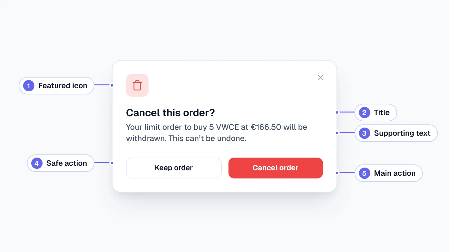
Every modal in the free file is built from the same five parts, so they read as one family.
- Featured icon: a 40px tile in one of four tones. Accent for everyday tasks, green for a completed result, amber for a warning, red for something that can’t be undone.
- Title: a question or a result, never a label. “Cancel this order?” beats “Order cancellation”.
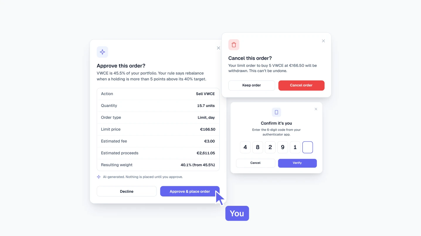
- Supporting text: the amount, the instrument and the account, in numbers. “Your limit order to buy 5 VWCE at €166.50 will be withdrawn” leaves nothing to guess.
- Body: only what the decision needs, such as a summary table, two or three fields, or a short list of options.
- Actions: the safe choice on the left, the main action on the right, labelled with the verb and, where it helps, the amount.
A close button sits in the top-right corner of every modal, and Escape closes it too.
Six rules for modals that move money
1. Put the numbers in the modal
The user should be able to decide without remembering the previous screen. The Sell whole position modal says “You’re selling all 131.7 VWCE. At €166.50 that’s about €21,928.05.” Units, price and total, all visible and all adding up.
2. Name the action on the button
“Confirm” and “OK” make the user reread the modal to know what they’re agreeing to. Use the verb, and the amount when money leaves the account: “Buy VWCE”, “Sell all”, “Withdraw €1,200.00”.
3. Keep red for what can’t be undone
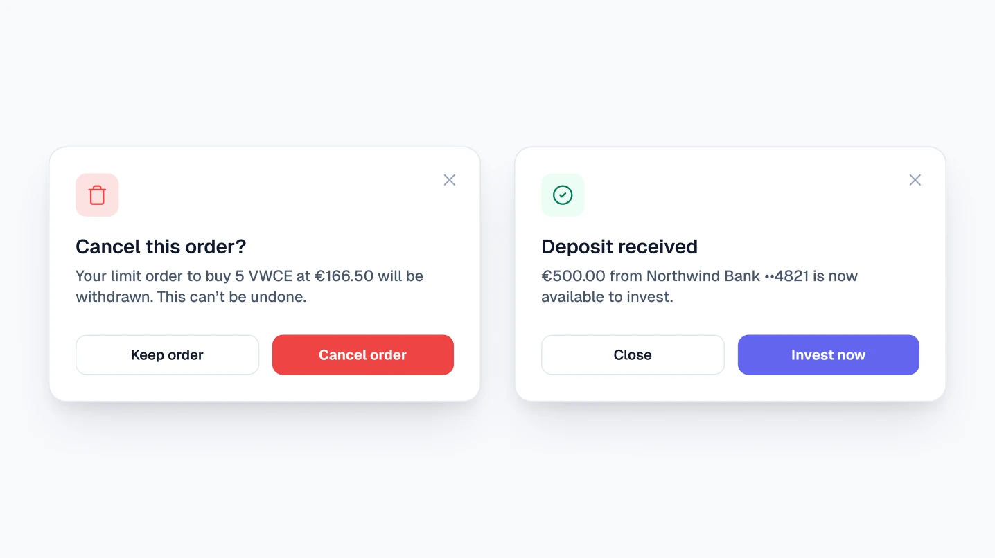
Red buttons belong to cancelling an order, selling a whole position and closing an account. Everyday actions use the accent colour, and green stays for gains and losses. More on this in Green and red in finance UI.
4. Make the safe choice the easy one
The safe action sits on the left as a secondary button, the main action on the right. For anything irreversible, the W3C dialog pattern suggests starting keyboard focus on the least destructive action, so a stray Enter doesn’t sell a position.
5. Match the friction to the risk
A result needs no friction: “Deposit received” has two buttons and closes in one click. A withdrawal asks for a password. Closing an account asks the user to type CLOSE. Each step up in friction matches a step up in what could go wrong.
6. Never let AI act without one
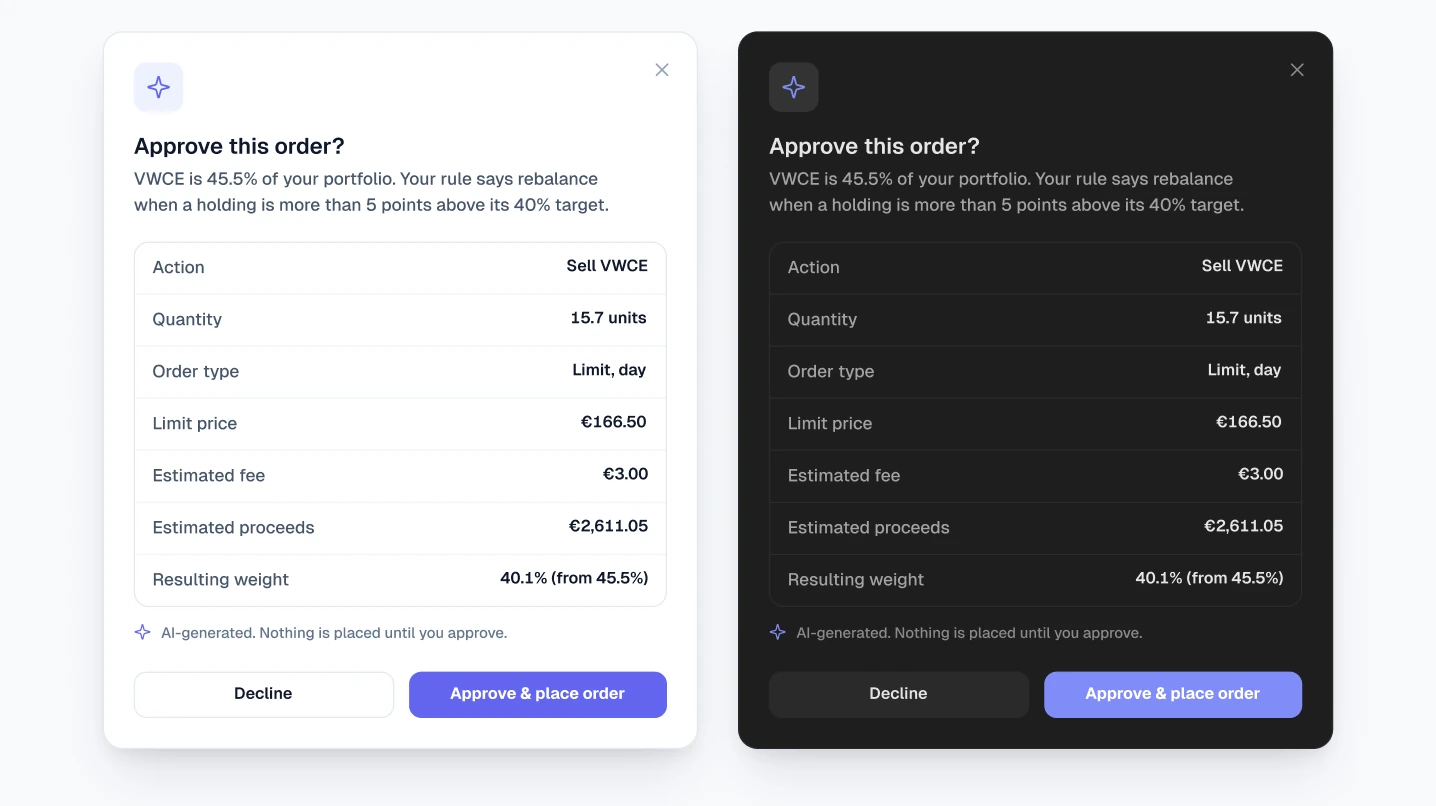
When an AI assistant proposes an order, the modal is where the user stays in control. The Approve this order? modal shows the rule that triggered it, every line of the order, the fee and the resulting weight, and labels itself “AI-generated. Nothing is placed until you approve.” More in Designing AI features for fintech.
Build it so everyone can use it
The W3C dialog pattern sets four basics for developers. Focus moves into the modal when it opens. Tab cycles inside it. Escape closes it. Focus returns to the button that opened it. The modal also needs a label, usually pointing at its visible title, which is one more reason every title should say what the modal is for.
Free Figma file: 30 fintech modals
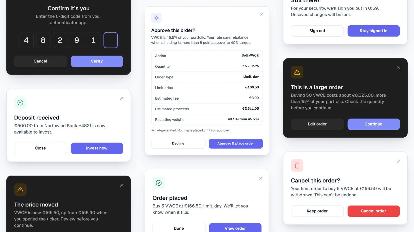
Every modal is one variant of a single Modal component, so you switch between them with the Type property. They’re built from shared parts and colour variables, so changing the accent or switching to dark mode updates all 30 at once.
- Trading: order placed, price moved, cancel order, large order, sell whole position, buy ticket, AI approval
- Money in and out: deposit received, deposit from, schedule a deposit, add a card, withdraw, enter your password
- Account and security: log in, before you start trading, verify your address, 2FA code, email code, session timeout, statement, close account
- Plans and settings: investing plan, pause plan, notifications, price alert, display currency, tags, invite link, invite adviser, read-only access
Also inside: light and dark modes from 26 colour variables; buttons, inputs, selects, checkboxes, toggles, radio cards, tags and 35 icons as components; text styles in Geist; and numbers that add up, from the Viola UI dataset. Get the free fintech modals.
Checklist
- The modal is for something irreversible, a security step, one short input or a result worth noticing
- The title is a question or a result, not a label
- Amount, instrument and account are in the text, and the numbers add up
- The main button names the action, with the amount when money leaves
- Red only for actions that can’t be undone
- The safe action is easy to reach, and focus starts on it for irreversible actions
- Friction matches the risk: none for results, a password or a typed word for the riskiest steps
- AI never places anything without an approval modal
- Focus is trapped inside, Escape closes, focus returns to the trigger
- It works in dark mode
FAQ
When should I use a modal instead of a page?
When the task is short and the user must finish or cancel it before doing anything else: confirming an order, entering a 2FA code, setting a price alert. If the user needs to compare options or fill a long form, use a page.
Should every trade have a confirmation modal?
Not always. A clear order ticket with a review step can replace it. Add a modal when something changes the risk: a large order, a price that moved, or an action that can’t be undone.
Should the confirm button be red?
Only when the action can’t be undone, like cancelling an order or closing an account. Buying, depositing and saving settings use the accent colour.
How wide should a modal be?
The free file uses 400px for simple confirmations, 440–480px for modals with fields or options, and 560px for horizontal layouts with the icon beside the text.
Need the whole product?
The full Viola UI kit uses the same components and colour variables across 100+ screens in light and dark, with one dataset behind every number. $49 for one designer, $179 for a company.
Sources
- Modal & Nonmodal Dialogs: When (& When Not) to Use Them, Nielsen Norman Group
- Dialog (Modal) Pattern, W3C ARIA Authoring Practices Guide

WRITTEN BY
Kseniya Savitsyna
Product designer working on fintech & AI products, and the designer behind Viola UI.