4 styles · 3 screens each
Restyle examples
One kit, unlimited looks. The same three screens and the same components in every style. Only colour values, one font, corner radius and a few effects change, and the panel for each style lists what changed from the original.
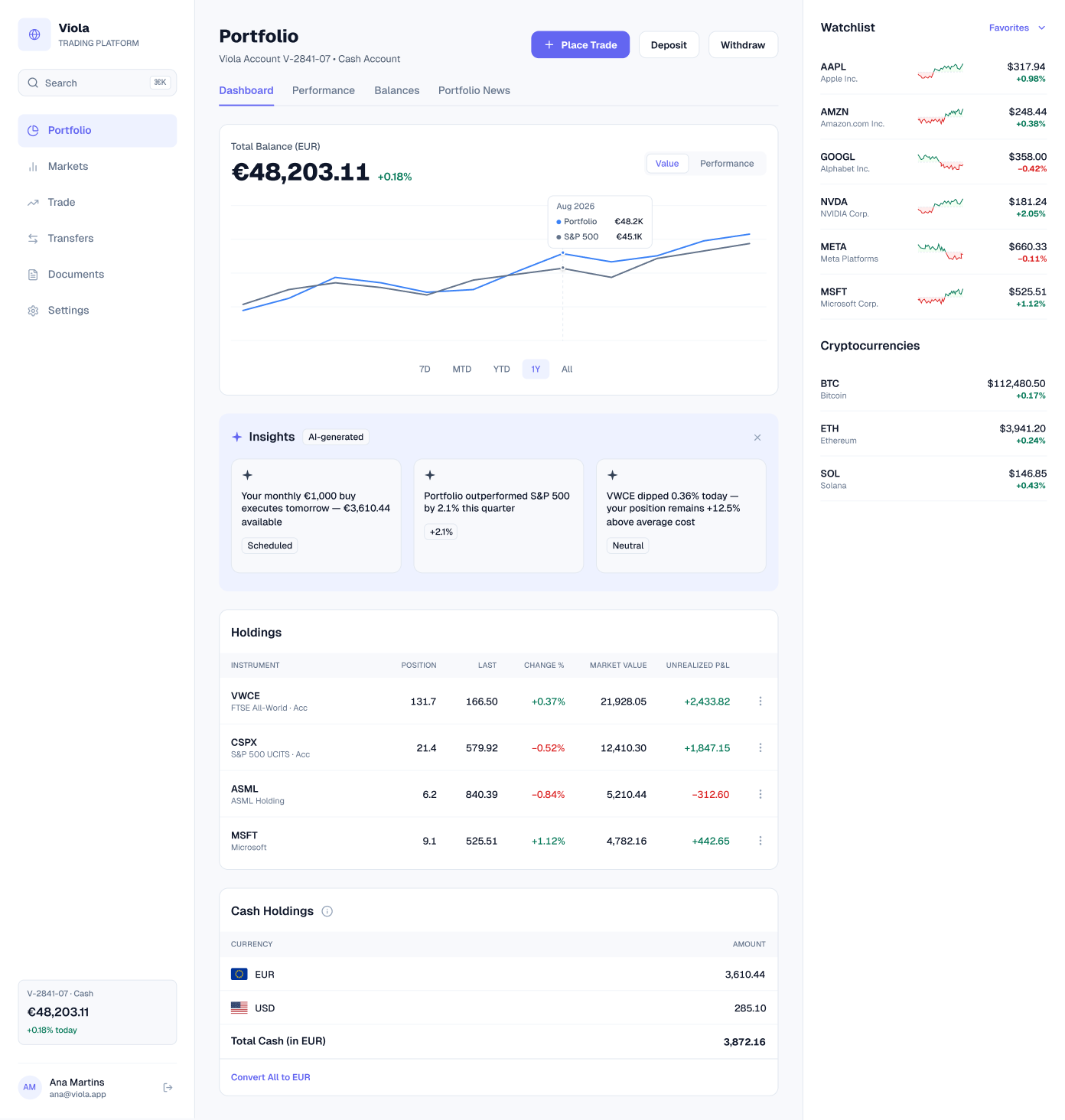
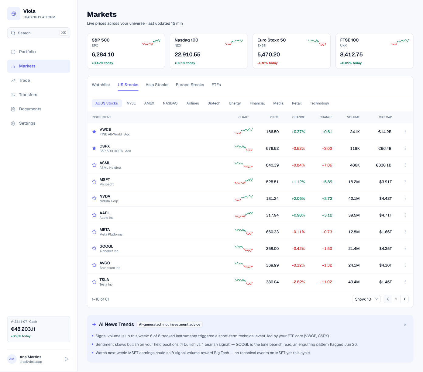
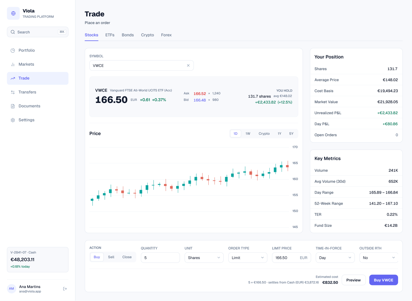
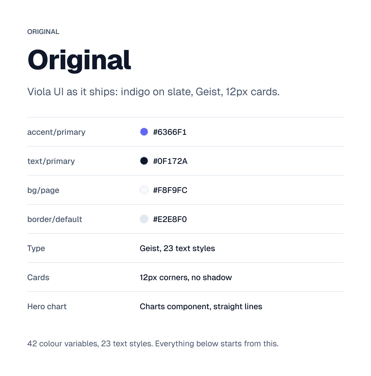
Original
Viola UI as it ships: indigo on slate, Geist and 12px cards. 42 colour variables and 23 text styles. Every restyle below starts from this.
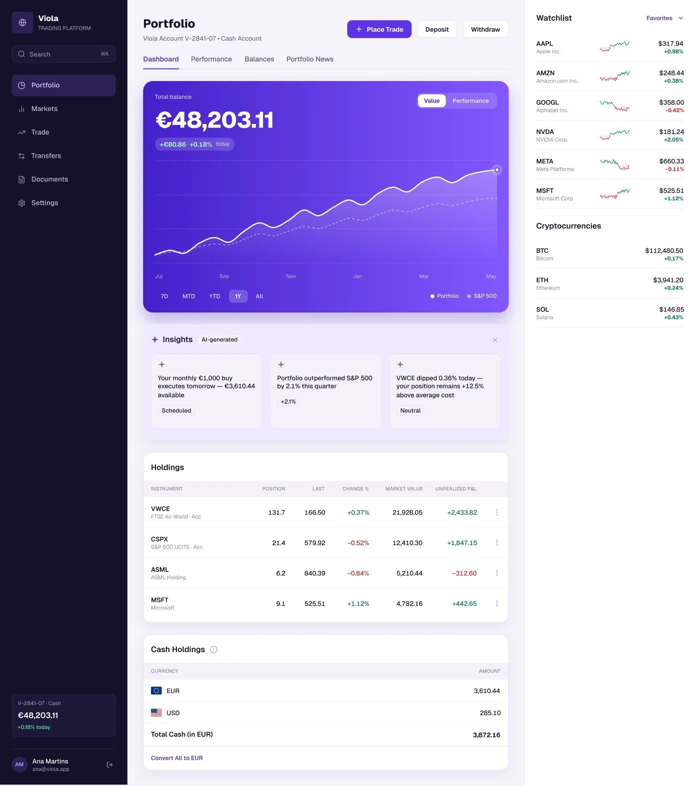
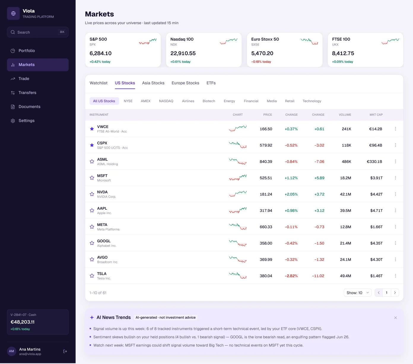
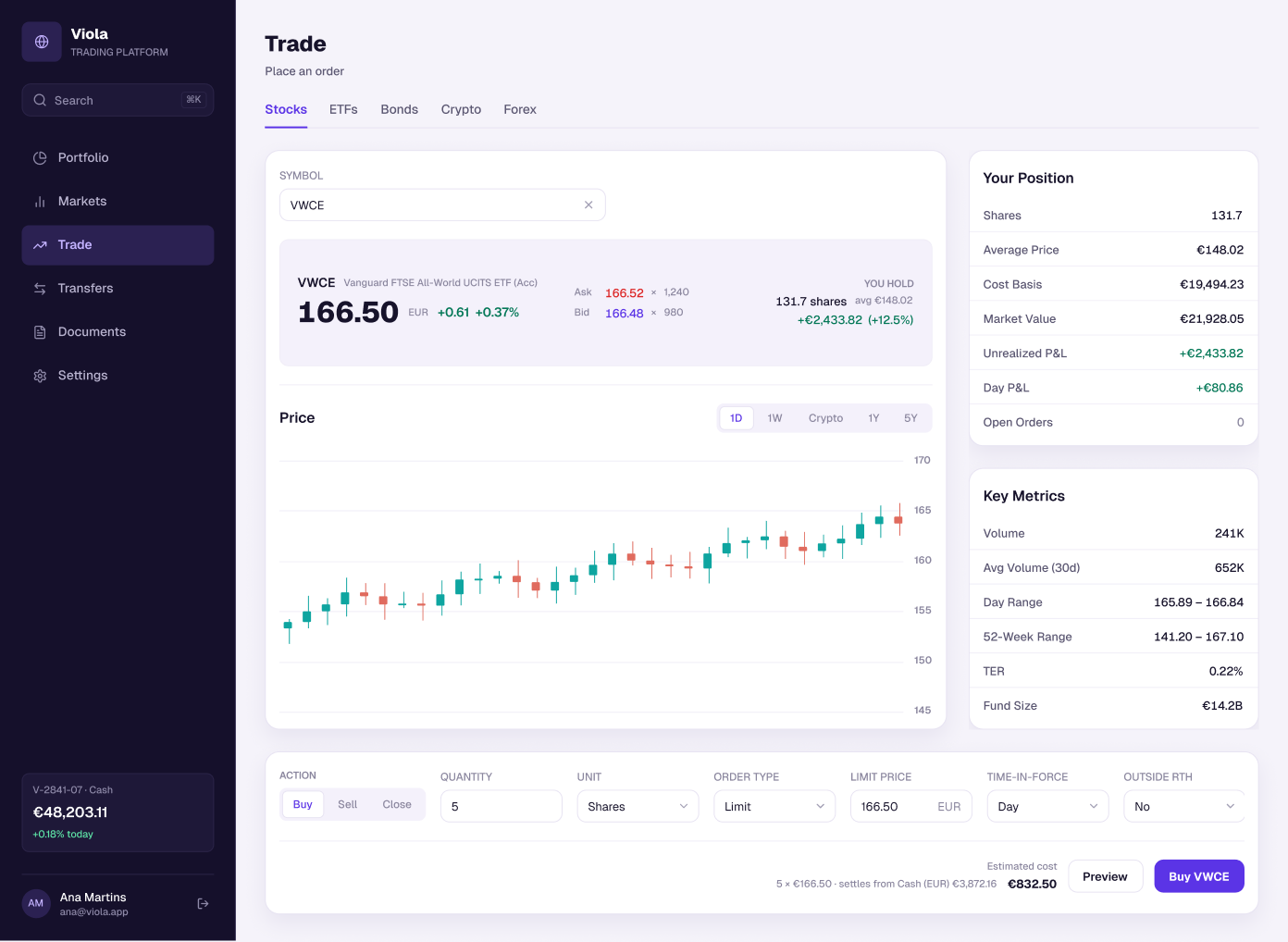
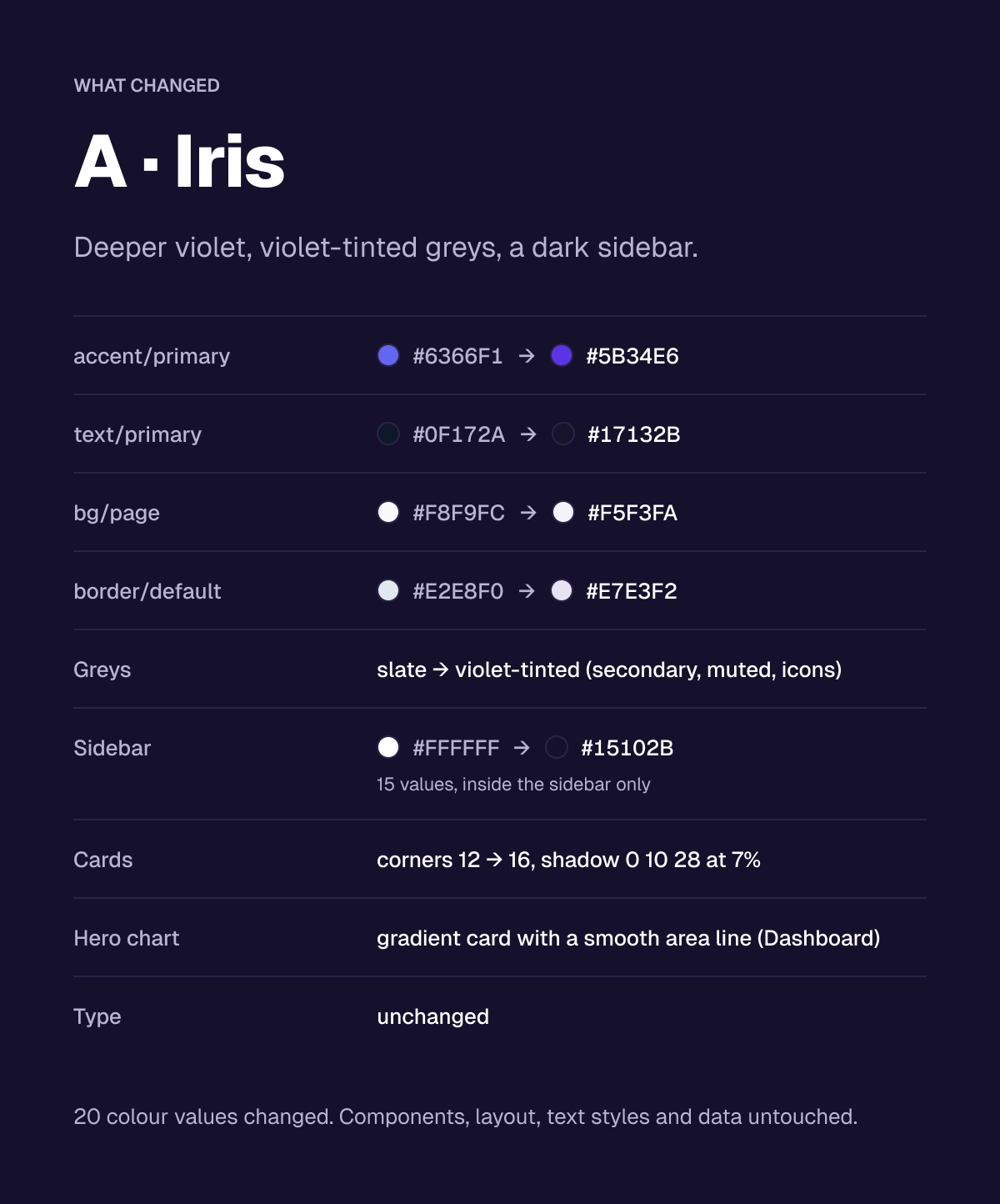
A · Iris
Deeper violet, violet-tinted greys and a dark sidebar. Cards get 16px corners and a soft shadow, and the Dashboard hero chart becomes a gradient card with a smooth area line.
20 colour values changed. Components, layout, text styles and data untouched.
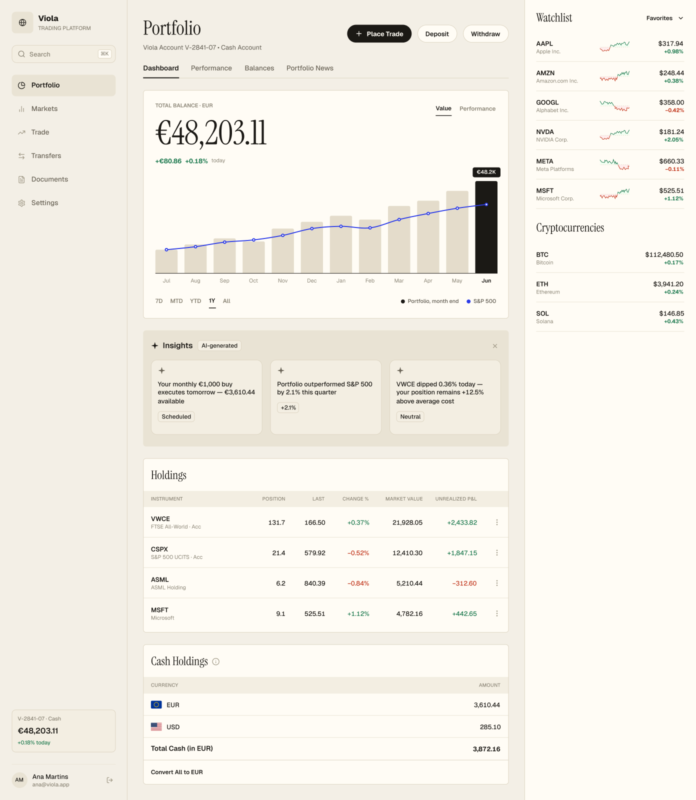
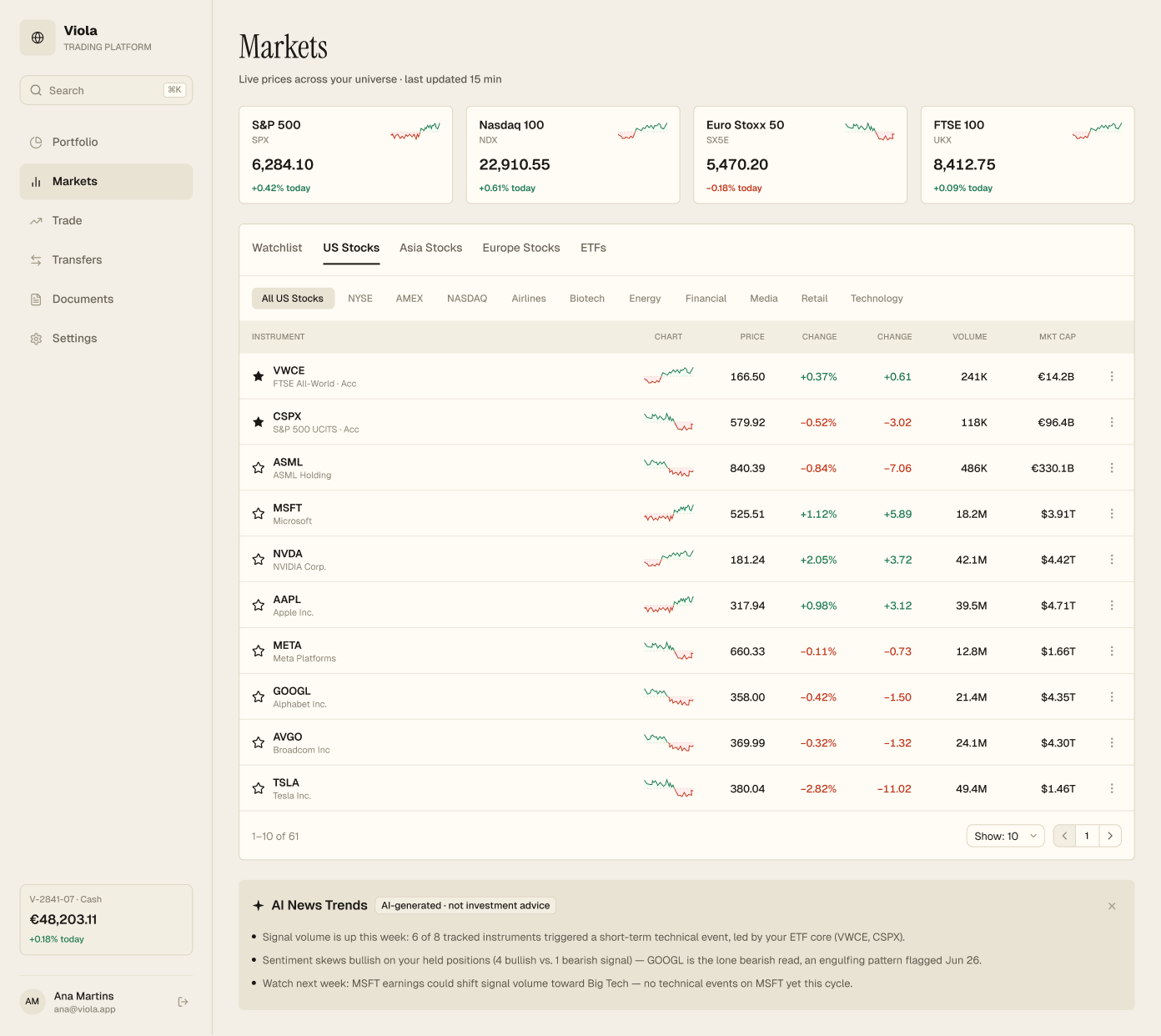
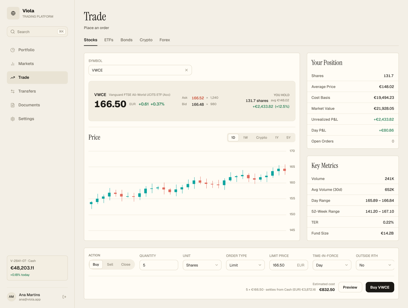
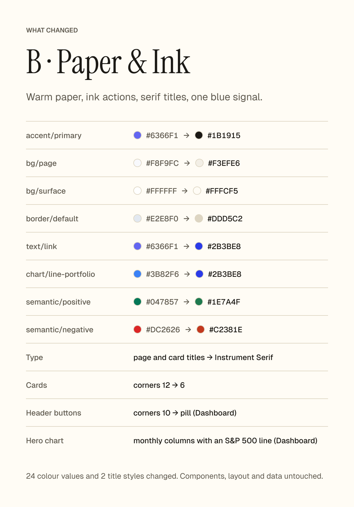
B · Paper & Ink
Warm paper, ink actions, serif titles and one blue signal. Page and card titles use Instrument Serif, cards get 6px corners, header buttons become pills, and the hero chart shows monthly columns with an S&P 500 line.
24 colour values and 2 title styles changed. Components, layout and data untouched.
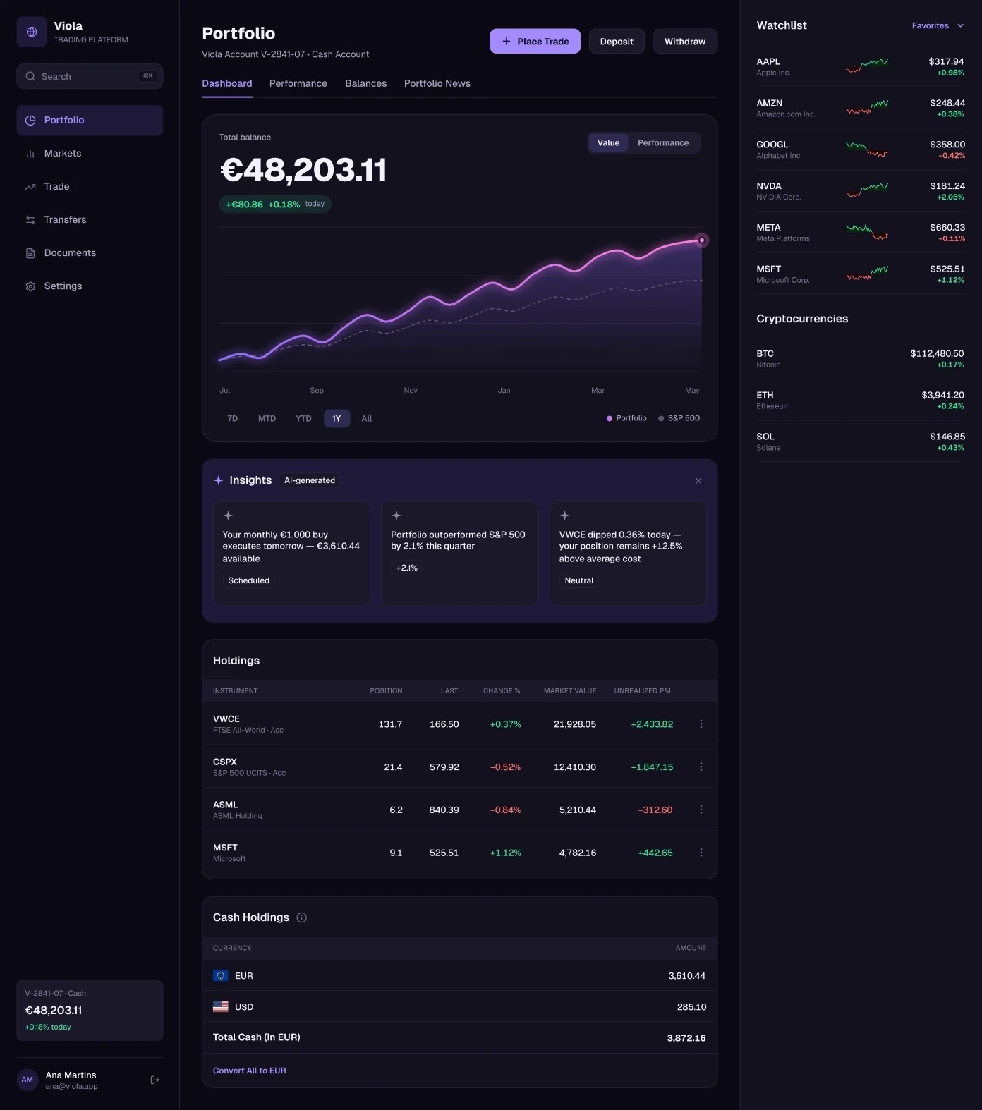
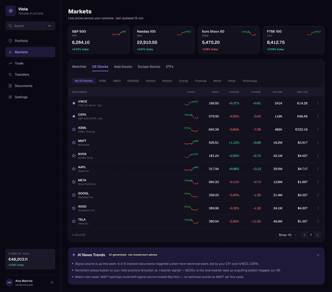
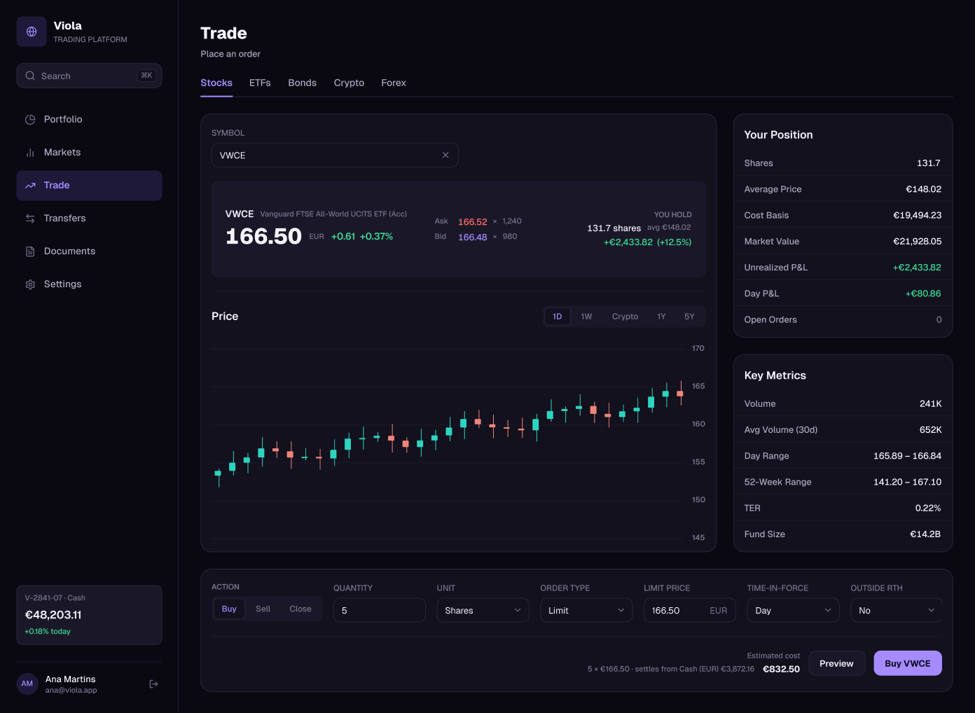
C · Midnight
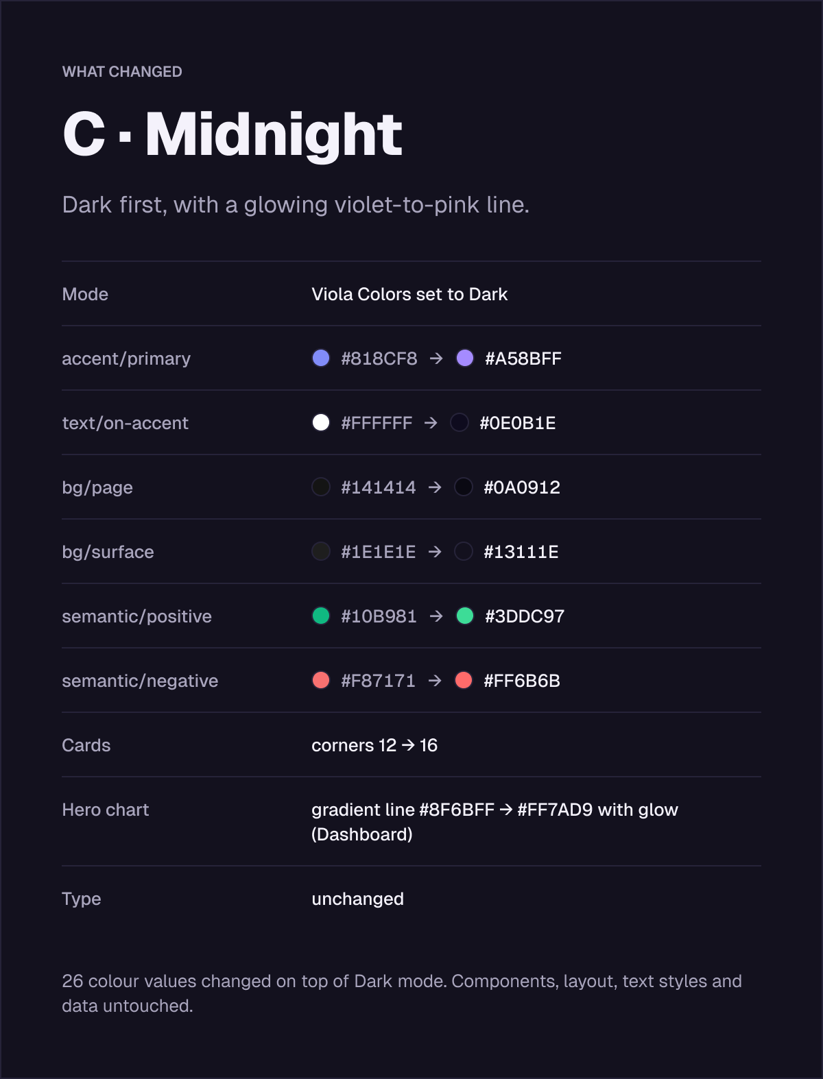
Dark first, with a glowing violet-to-pink line. Built on the kit’s Dark mode, with deeper backgrounds, a brighter accent, 16px corners and a gradient hero line with a glow.
26 colour values changed on top of Dark mode. Components, layout, text styles and data untouched.
Get the file
The restyle examples are in the full Viola UI kit, next to 100+ screens in light and dark. Open the file in Figma and start from any screen.